CSS and fractional font size

A while ago I had to fit a string into a navigation menu column and didn't want to make it any wider than it already was. In my case a font size of 14px was too high while 13px felt like it was harming the readability. Testing with 13.5px I felt like I had found the sweet spot. But as I had never seen a fractional font size in style sheets before I wondered if this was allowed and supported. My coworker wasn't able to give me an advise and on StackOverflow the related discussions questioned how one should be able to render a fractional font size on an absolute pixel.
But subpixel rendering is a tried and tested technology for at least 20 years. We even have algorithms that leverage the positions of the individual red, green and blue pixel parts of specific displays. Something you will see in most of the examples below.
Surprisingly the official documents don't provide any specific's either. See https://www.w3.org/TR/CSS1/#length-units.
So when no information can be found. Let's actually test it out.
The test subjects
- Firefox (76.0.1)
- Chromium (83.0.4103.61)
- Microsoft Edge (44.18362.449.0 - not Chrome based)
- Microsoft Internet Explorer 11 (11.900.18362.0)
- Opera (68.0.3618.125 - uses the same renderer as Chromium)
The test
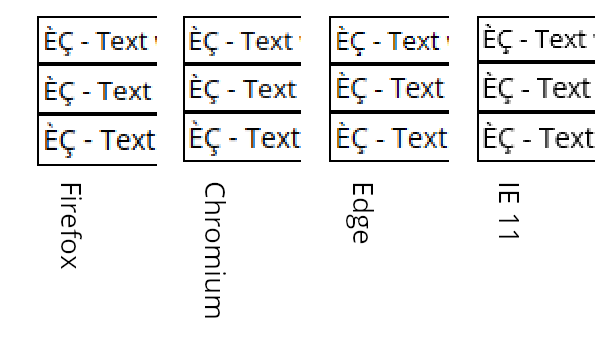
I put 3 div elements on top of each other with font sizes 13, 13.5 and 14 px respectively and made screenshots in all browsers.
<div style="font-size:13.5px;">
    ÈÇ - Text with font size 13.5px
</div>
The font I used is Open Sans loaded as a TTF resource.
Here you can see how this looks like:
divs rendered by your browser:
Vertical comparison
2x zoom:

So putting all screenshots next to each other makes some things evident:
- Fractional font-sizes do actually work in all tested browsers.
- There are rendering differences between all browsers. At least between Chromium and Edge the
divborders and the font base lines align. - IE 11 only uses anti-aliasing (grey-scale) to have smooth lines while all other renderer use an RGB value on the neighbouring pixels to trigger individual color subpixels of your display (see ClearType or FreeType). You will notice the orange shadow left of a darker pixel and blue shadow to the right.
divborders always align with a full pixel.
For a better comparison of the font sizes I aligned all base lines in the next image.
2x zoom:

As you can see the x-height and cap height are consistent for 13px font size between all browsers (with sub- and superscript it takes 15px).
At 13.5px the first differences occur. Caps heights (and overall height) in Edge and IE 11 are one pixel larger than those in Firefox and Chromium.
At 14px the caps heights align again between browsers. But now the overall height of the characters in Edge and IE 11 is 2 pixels lower.
Horizontal comparison
Those are the texts with font size 13.5px aligned for text length comparison.
2x zoom:

Because of the subpixel rendering it's not trivial to align the texts. But it can be seen that the variance in length between those texts lies at 1px for a 190px text which I would consider nearly identical.
Verdict
The major browsers I tested did a good job in rendering texts with fractional font sizes, even though I couldn't find any official or in-official recommendations concerning the usage of those. But as fractional em value would often lead to a fractional font-size too, I don't see how this is not a viable way to style your texts.
The CSS box model sticks to integer values even if it includes fractional font sized text. I guess this prevents some lay-outing nightmares.